Card A
Auto-fit columns using repeat(auto-fit, minmax(260px, 1fr)).
CSS provides two powerful layout systems. Grid is ideal for two-dimensional layouts (rows and columns). Flexbox excels in one-dimensional flow (a row or a column). Use them together for clean, responsive pages.
grid-template-columns, grid-template-rows, and gap.repeat(), auto-fit, and minmax() minimize media queries.The cards below auto-wrap into responsive columns. Resize the window to see it adapt.
Auto-fit columns using repeat(auto-fit, minmax(260px, 1fr)).
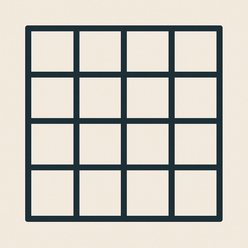
Consistent spacing via gap. Borders provide structure.
Each card has padding and a hover effect for feedback.
Great for galleries, feature grids, and dashboards.
.grid{
  display:grid;
  gap:1.25rem;
  grid-template-columns: repeat(auto-fit, minmax(260px, 1fr));
}display: flex, flex-direction, justify-content, align-items, and gap.Row alignment with spacing and an action cluster.
Switch to a column for a clean vertical stack with even spacing.
Aligned naturally in a column; card styling adds padding and border.
Use Flex for stacks, settings panels, or sidebars.
.toolbar{
  display:flex; gap:.75rem; align-items:center;
}
.toolbar .spacer{ margin-left:auto; }